
Using the dashboard
Learn how to use the dashboard in Zuora Analytics to view and manage key subscription metrics through interactive cards.
In Zuora Analytics, a dashboard displays key subscription metrics as interactive cards. You can view and interactively analyze data that is shown in various cards in a dashboard. You can perform various actions to customize the layout of a dashboard.
Five dashboards are allowed in each tenant. Administrators can configure the default dashboard for the tenant. Each standard user can configure the default dashboard for themselves.
View a dashboard
To view the default dashboard, navigate to Analytics > Dashboard in your Zuora tenant. The dashboard opens and displays key subscription metrics as cards.
To view and manage all dashboards on your tenant, navigate to Analytics > Explorer, and then select the Dashboards tab.
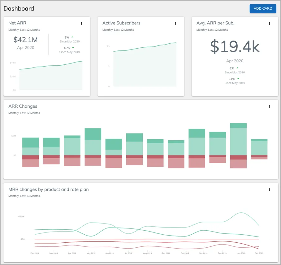
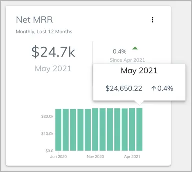
View the metrics shown in different cards. Hover over a chart to display a summary of data for any period, including the metric value and period-over-period rate of change.
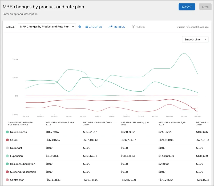
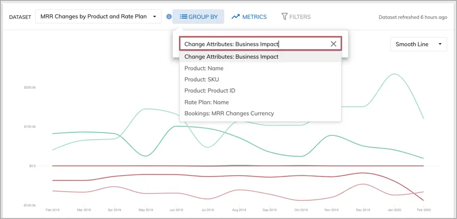
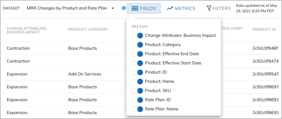
For a time series card, to change the attribute that data is grouped by, click Group By and click on the attribute text field. Then you can select any attribute that is available in the card.