

Zuora Benchmark Metrics
Explore how Zuora In-product Benchmark metrics are visualized using boxplots to represent data distribution.
Zuora In-product Benchmark metrics are represented as boxplots.
A boxplot is a visual representation of the distribution of a data set based on four data points including the minimum, first quartile, median, third quartile, and maximum.
Let’s consider the following example for interpretation:
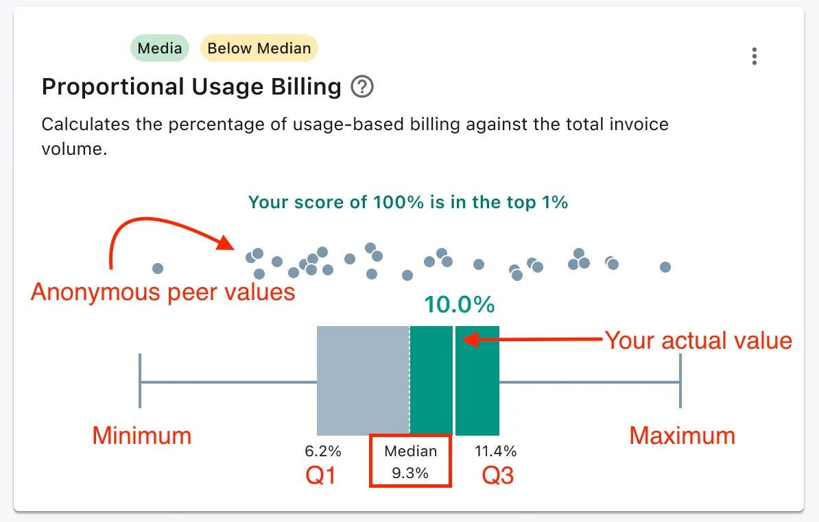
Here, the dotted line inside the box represents the median. Edges of the square show the 25th and 75th percentiles.